Ronaria
Modular kebaya for Gen Z, with no face of its own yet. Brand identity from zero.
- Ronaria
- 2024
- Fashion
- Business Branding
- Brand IdentityLogotypeLogomarkColor PaletteTypographyBrand Guide
The Brief
A modular kebaya rental brand aimed at Gen Z. A bold vision, but no face yet.
The Tension
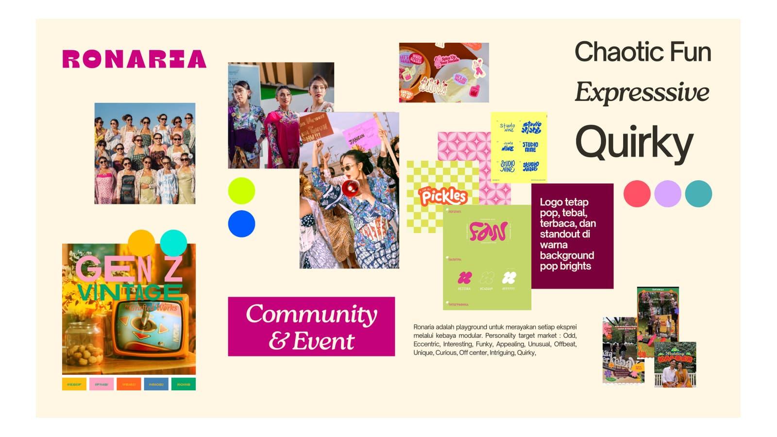
Kebaya still reads as formal, and as the previous generation’s. Ronaria wanted to flip that, without losing the elegance the garment is known for.
The Approach
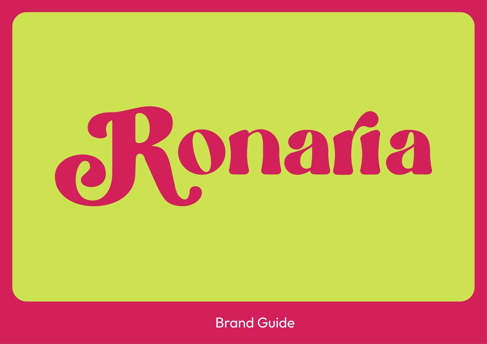
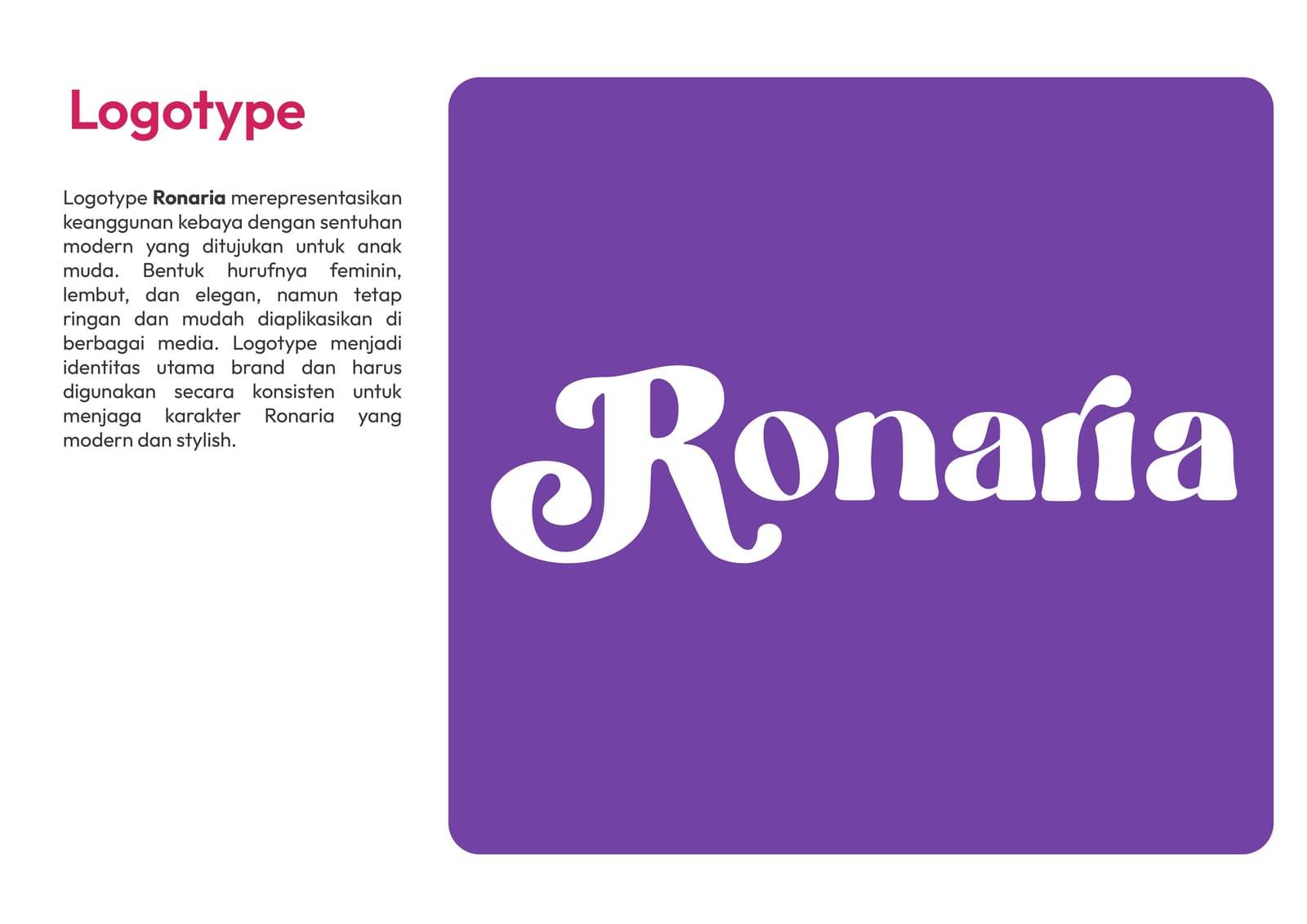
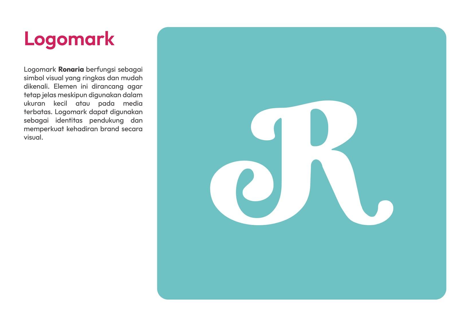
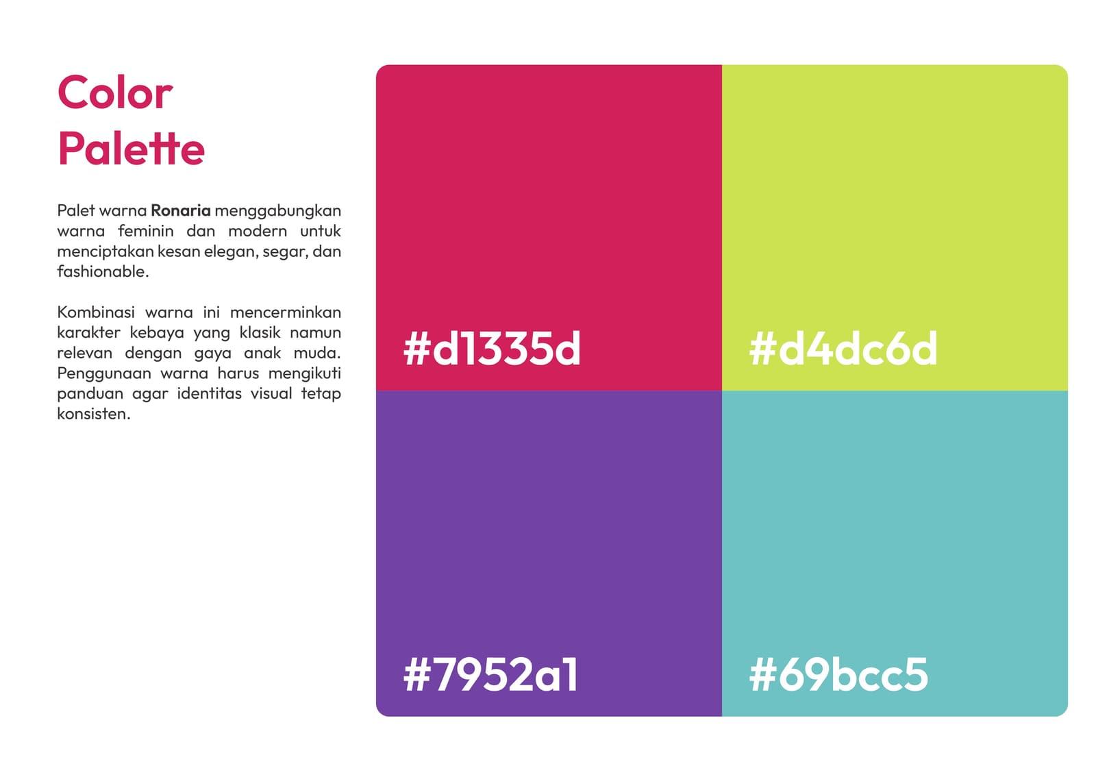
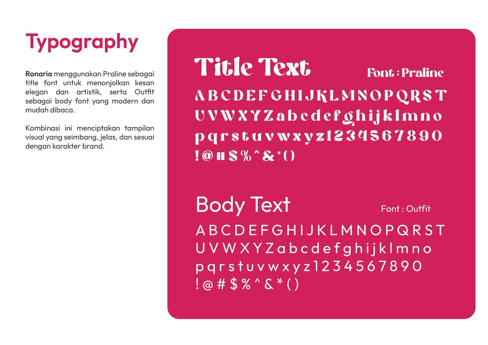
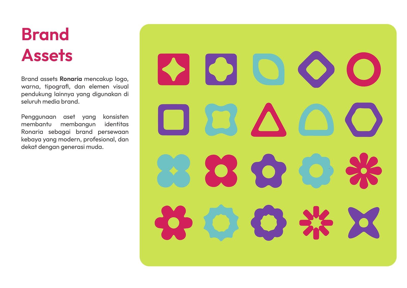
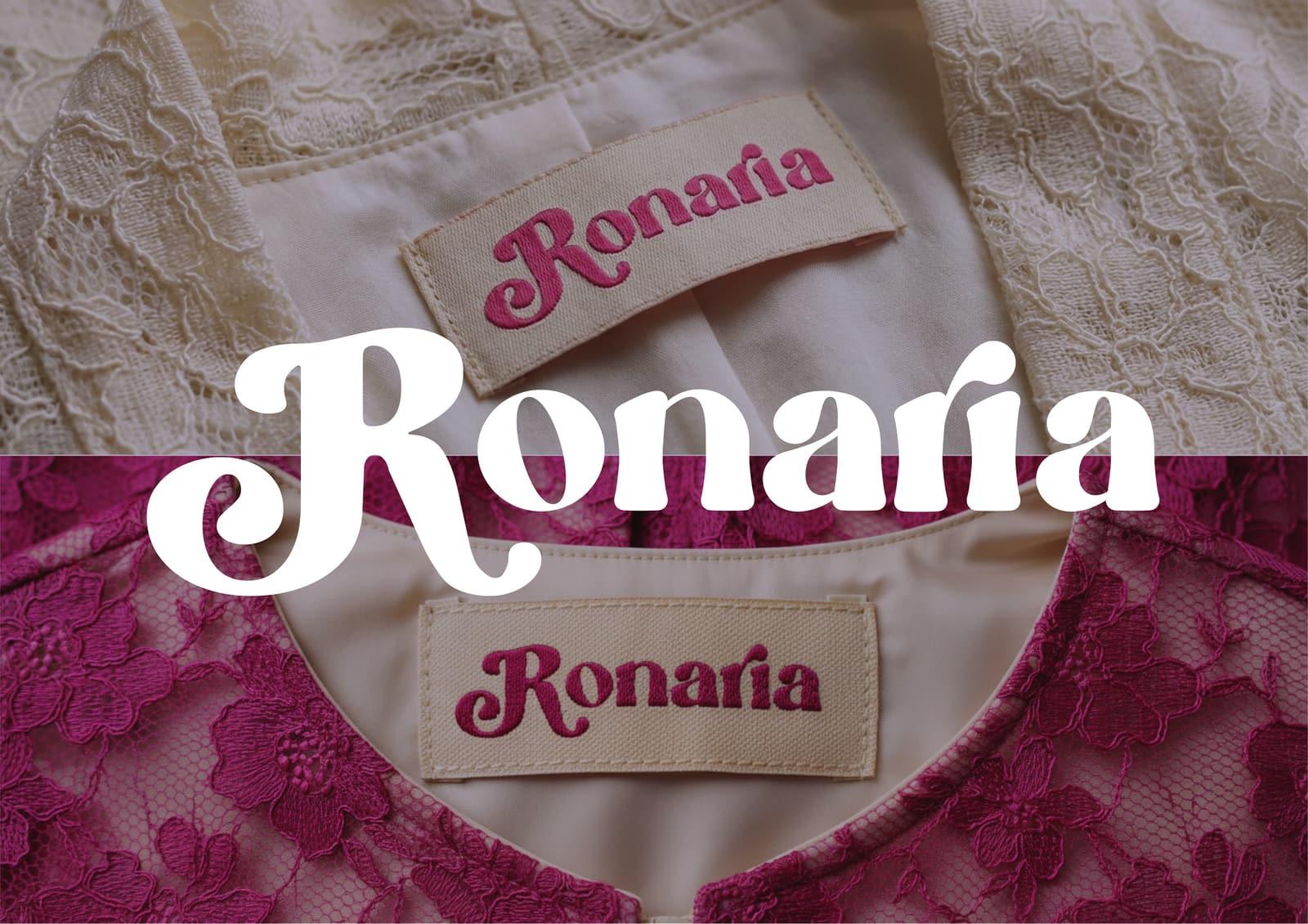
A visual identity built on one principle: chaotic fun, still legible. A pop, heavy logo, bold but controlled colour, and a system that survives an IG feed, a garment label, and an event.
The Shift
Ronaria now has a face, not just a logo and colours, but a complete visual system that stays recognisable wherever the brand shows up.